Grampton - Smart Weighing Scale Interface
To design a Smart Weighing Scale UI
Users
Primary
Operator
Working on the day-to-day operations of the weighing scale.
Supervisor (Admin)
Senior level staff, overlooking the tasks carried of the Operator.
The supervisor's role consists of assigning tasks to the operators and making sure these weighing scales are being operated with the right settings.
Secondary
Backend Team
The backend data entries reflect on the admin controls and are reflected on this weighing scale.
Constrains & Considerations

Low-res Display
To be made usable in a range of models offered, which may have different in specifications.

Capacitive Touch Screen
More durables since they are layered with a glass on top, but the touch inputs are not very precise.

Simple Interface
The user may not be fluent with the interface language. The design has to be kept simple and communicative.
Task Flow
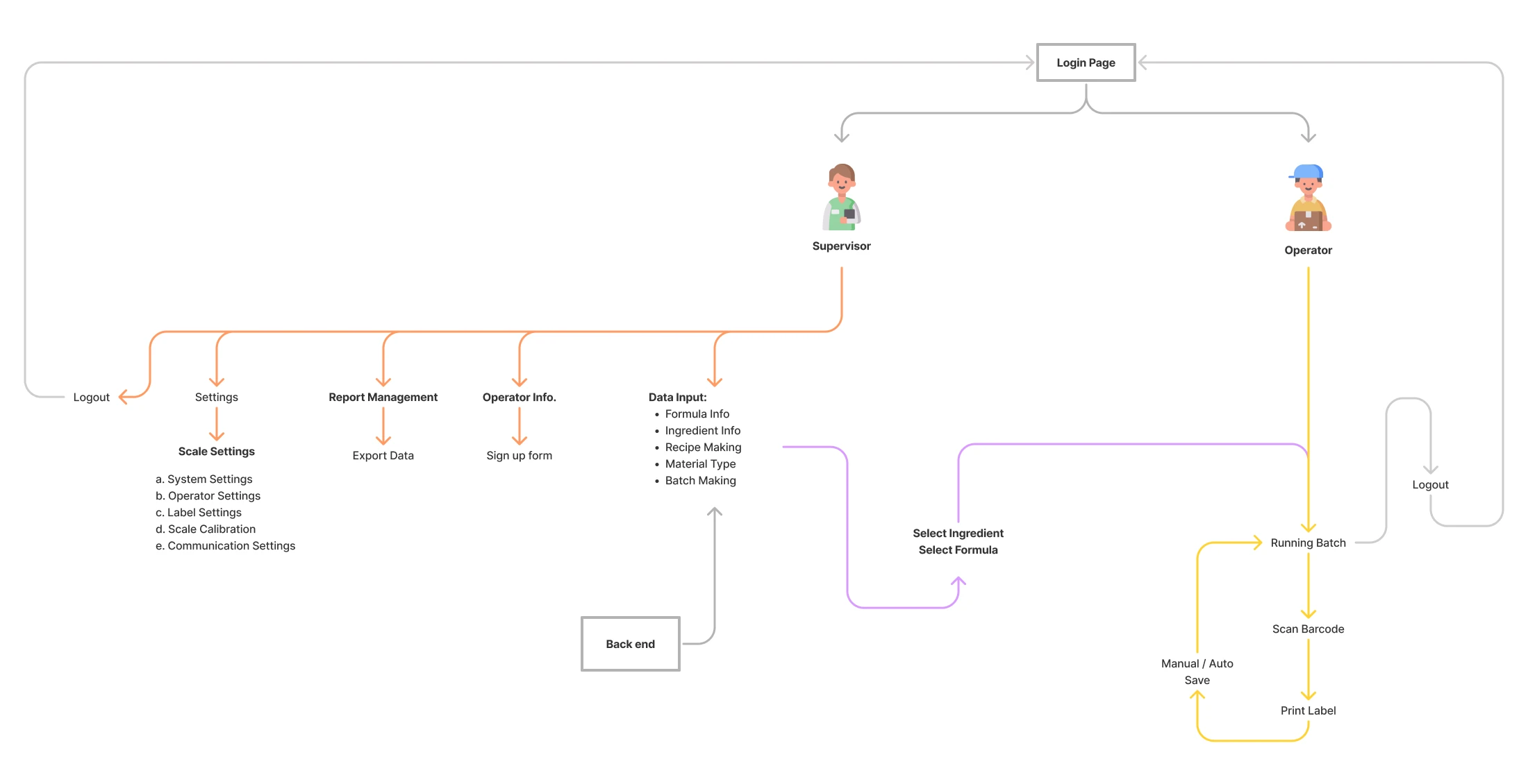
Operator is intentionally given limited access. The Supervisor, on-site, can control the machine configuration as and when required.
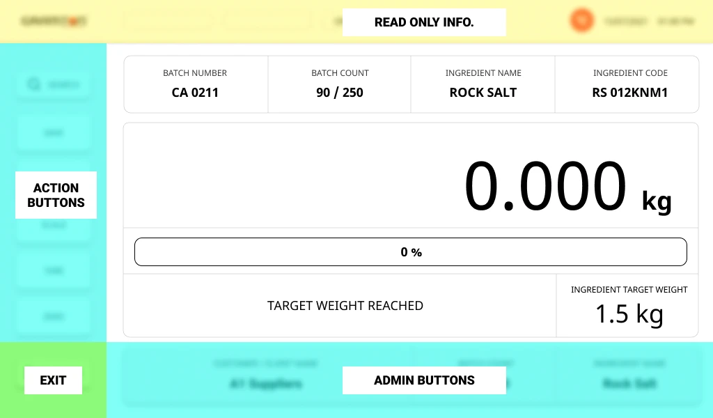
Low Fidelity Wireframes
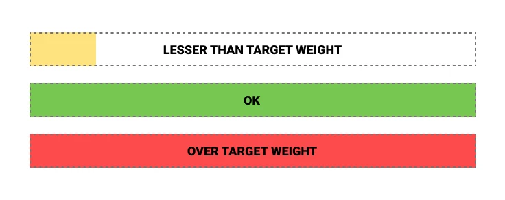
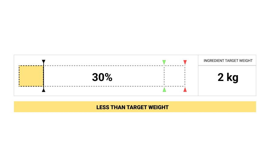
How to better communicate the target weight level?
Ideation

High Fidelity Explorations
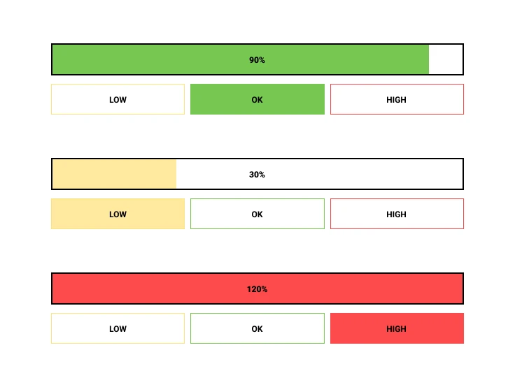
Making the information easy to read even at a glance.
Final Screens
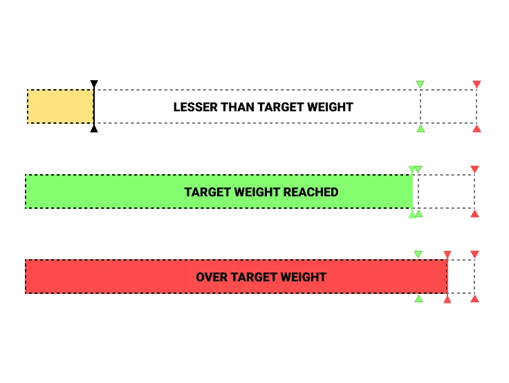
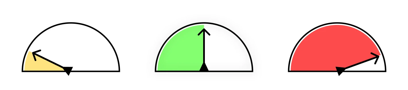
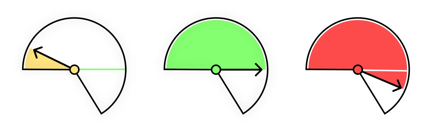
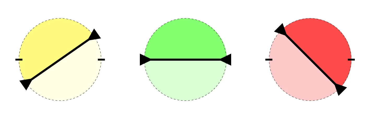
Zones
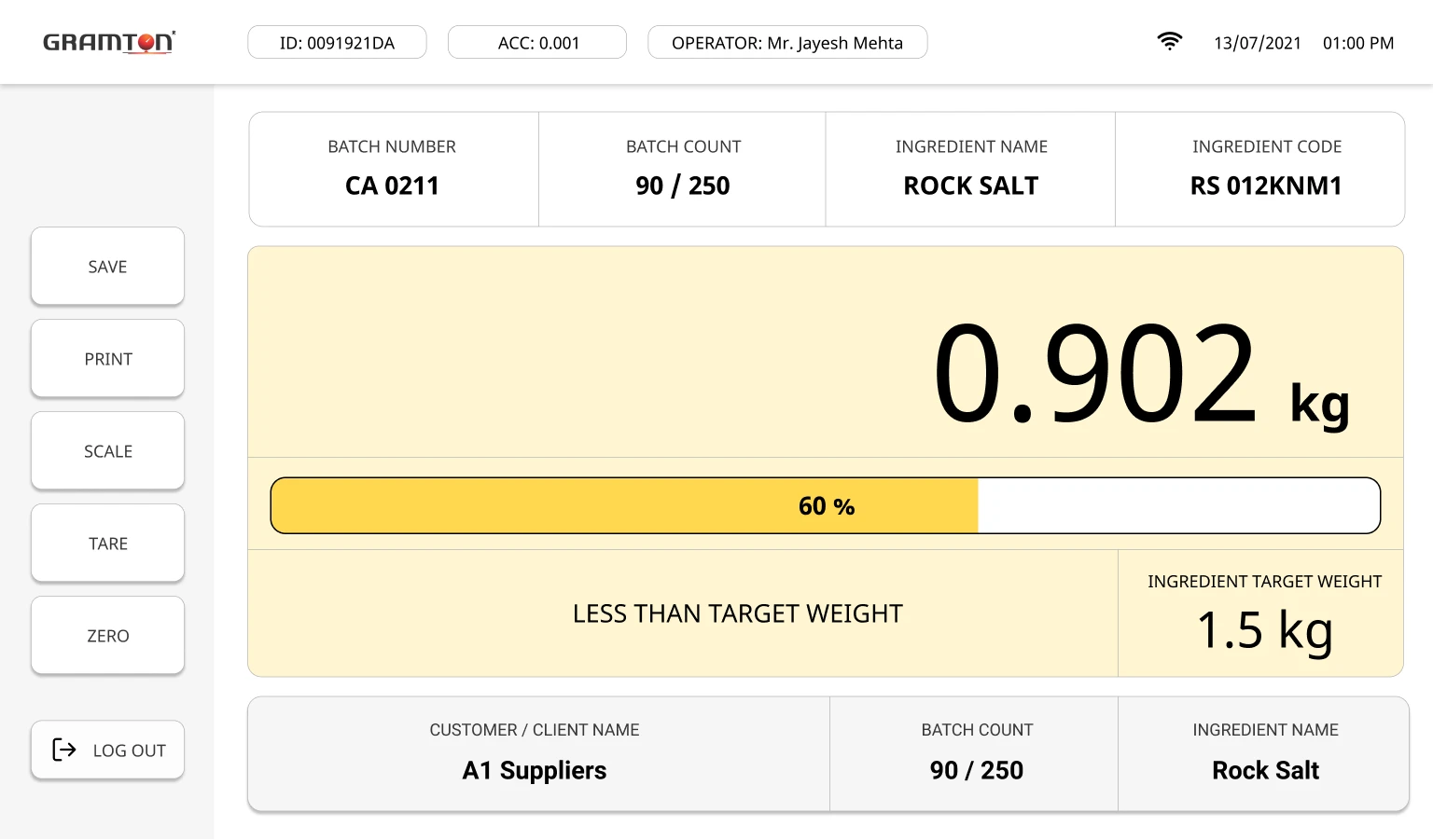
Below Target Weight
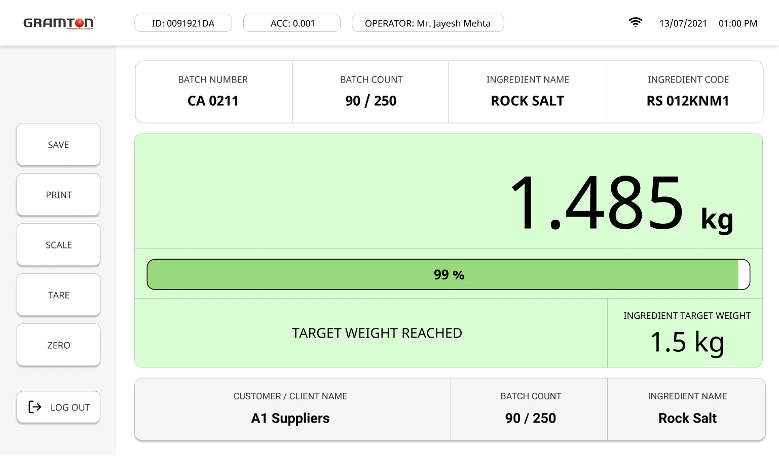
Target Weight Reached
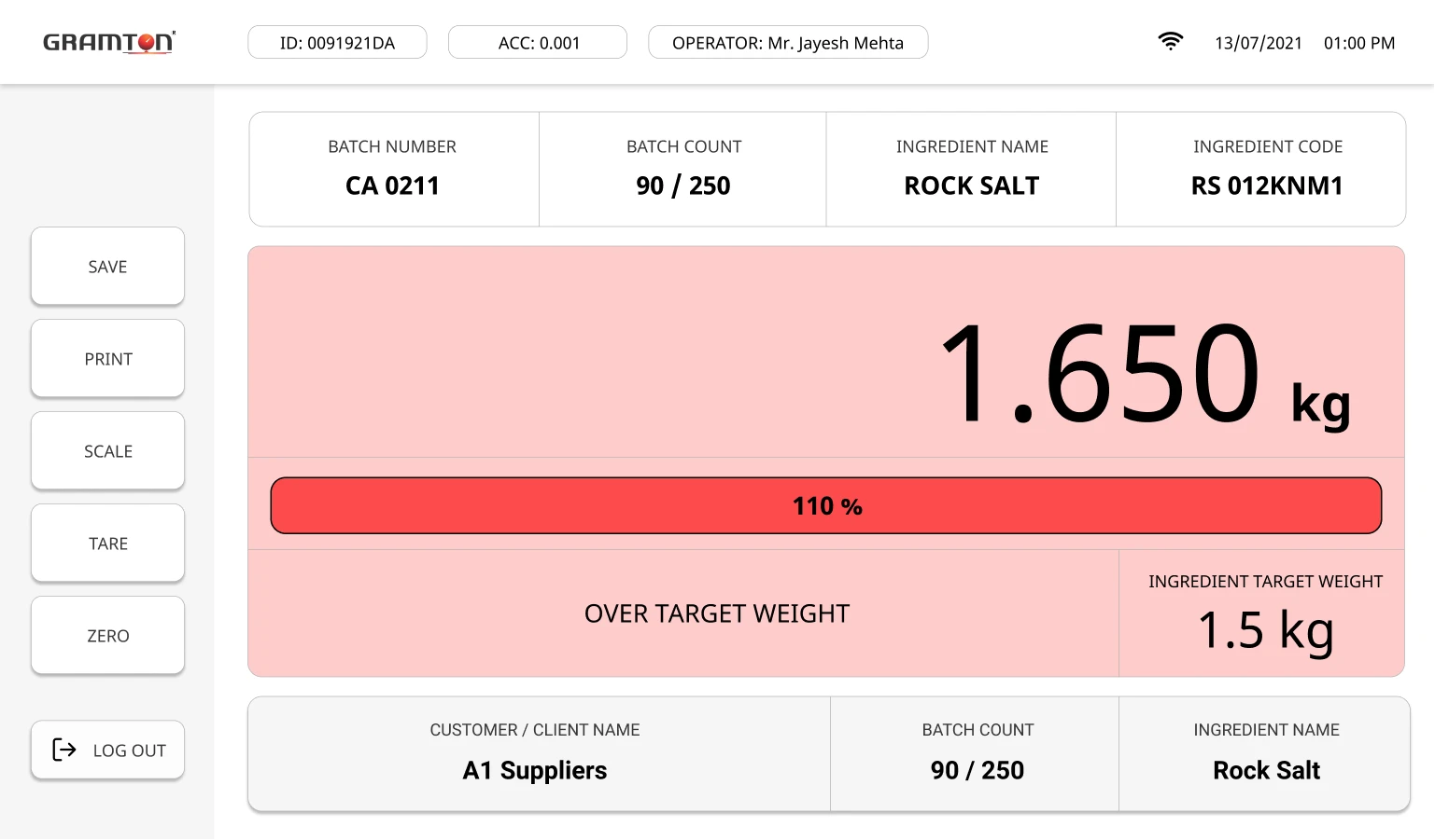
Over Target Weight
Final Flow
Design Details
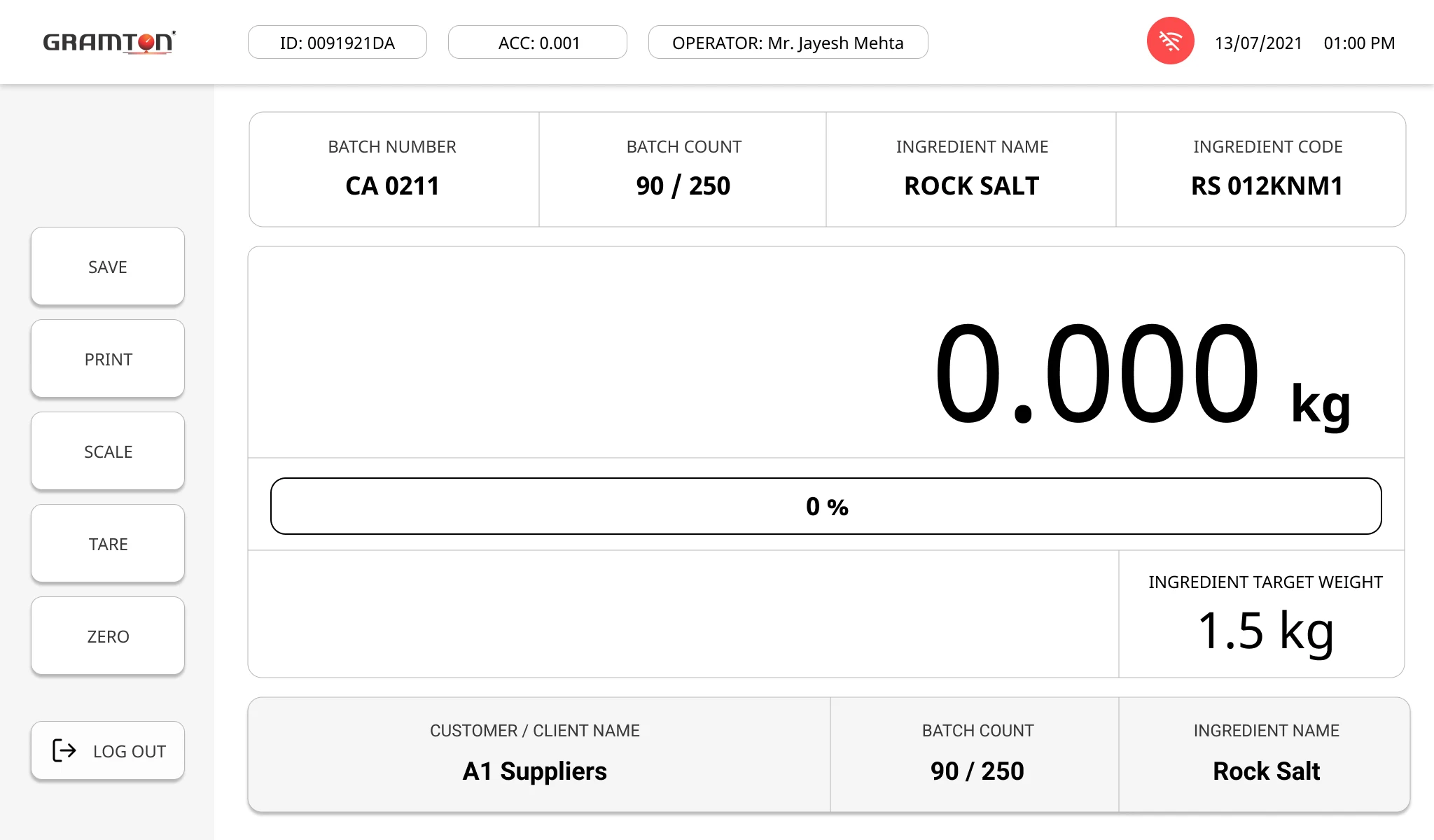
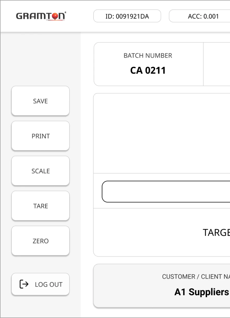
Essential Controls
Save, Print, Sale, Tares, Zero are the primary actions made big for
accessibility
Soft seperation
Grey region under the buttons creates
a clear separation between the
buttons and content.
Buttons
Clickable, shown with shadows and a tone difference
Operator's name
Operator name clearly shown on top centre. His/her name on the top
gives an assurance that they are logged in and their session is active.
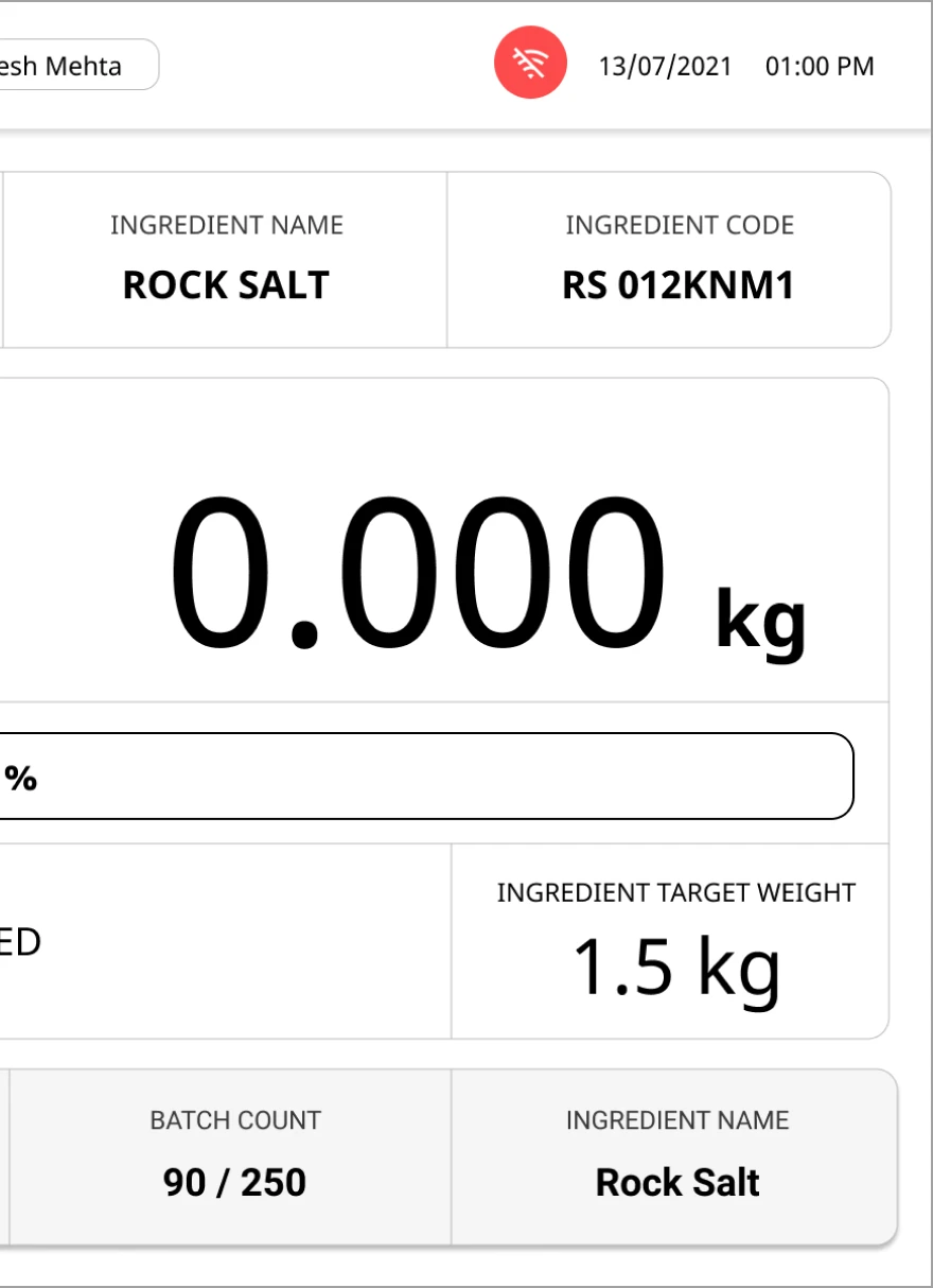
Offline state
Clearly alerts the operator in case of network issues, which might may cause issues with the task at hand.
Scale Weight
Weight in scale, currently shown big,
bold for utmost clarity.
Compare Target Weight
Current weight and Target weight can
be clearly compared at a glance by the operator.
Focus on the info.
Info made bold for legibility
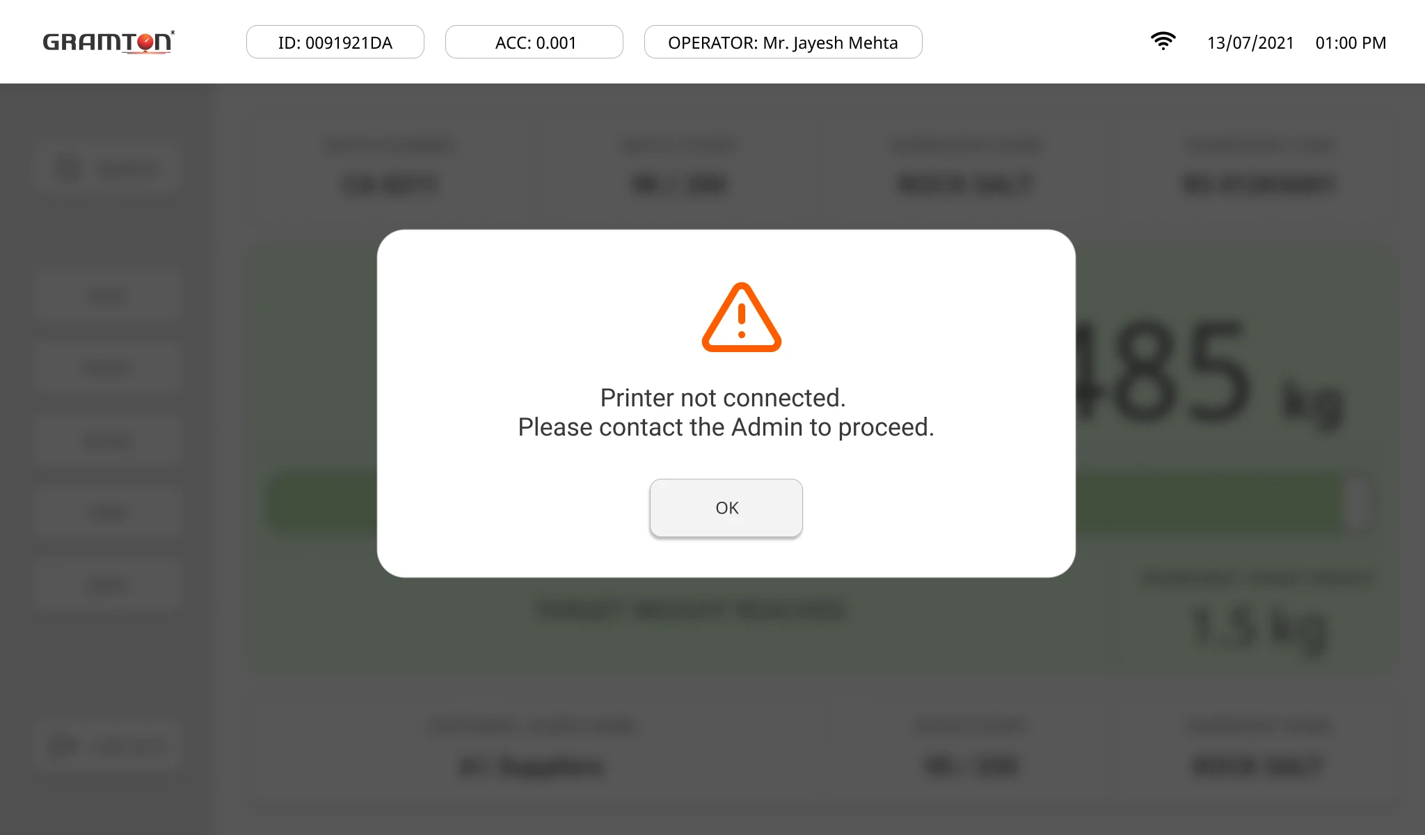
Error States
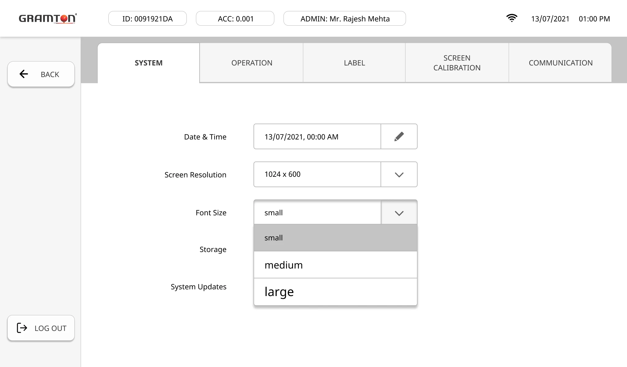
Font Sizes
For users who may be operating the Weighing Scale with weak vision/ using the machine from a distance to avoid eye strain.
It also helps improve the usability for challenging environments in which the machine may be operated in.
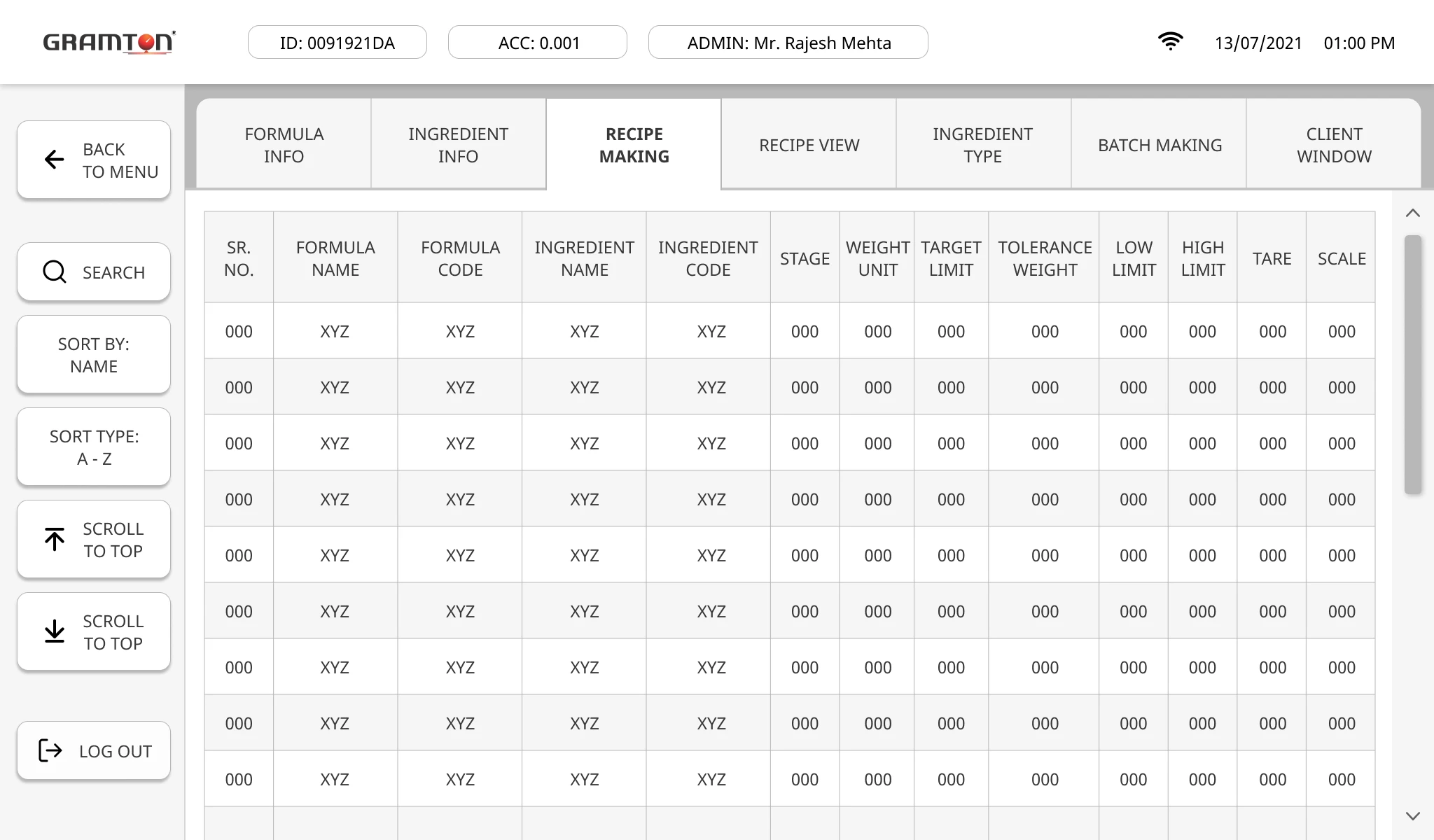
Information Dense Screens
Consistently maintaining clickable buttons on the left sidebar such as sort, scroll, search.
Credits:
feathericons.com
flaticon.com
thenounproject.com